Bold hook
START with the result


Shorts readability and placement
See how short lines, active-word emphasis and vertical placement work around the YouTube Shorts interface.
English subtitle example: Make the first line count keep Shorts captions compact highlight one useful word protect the bottom interface
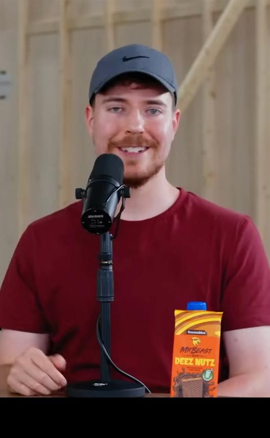
Visual examples
Bold hook
START with the result
Active word
Highlight one KEY word
Compact lines
Short phrases read faster
Safe placement
Stay above player controls
Why it works
Compact phrases can keep up with faster narration.
Account for title, controls and action elements.
One active word is often clearer than a full flashing line.
Product workflow
Use a 9:16 source or compose for that crop.
Break speech at natural phrase boundaries.
Preview outline, size, color and emphasis.
Check the final upload with YouTube UI visible.
Text, timing and words per frame
Font, color, stroke and presets
Position, alignment, size and safe zone
Supported motion and emphasis presets
From demo to project
The video above is a real interactive style preview, not a promise that every source clip will need identical settings. It demonstrates how timed words, emphasis and a selected preset can work together. Your uploaded video still needs its own transcription review, contrast check and placement decisions.
After upload, CapsAI creates the editable caption layer used by the editor. Check the spoken words first, especially names, brands, numbers and specialist terms. Then review where each phrase starts and ends. Styling a mistaken transcript only makes the mistake more visible.
Finally, judge the design against the complete video rather than one attractive frame. A white caption may be clear over a dark scene and disappear over the next bright shot. Position can also collide with faces, product details or platform controls as the footage changes.
Use this short quality pass before rendering a full video. It keeps the visual treatment connected to readable, accurate captions.
Use cases
Show each step without long subtitle blocks.
Emphasize names and key claims carefully.
Reposition captions after converting landscape footage.
A caption that is readable in the editor can be hidden by YouTube interface elements after upload. Keep essential words away from the extreme bottom and right edge.
Use the actual 9:16 preview and test on a phone before publishing a series.
Word highlights can follow quick speech, but viewers still need enough context to understand the phrase. Keep nearby words visible and avoid single-word flashes with no context.
Correct timing and line breaks in the editor when automatic segmentation does not match the spoken idea.
Questions
Bold active-word or clean high-contrast styles can work when phrases stay short and inside the safe area.
One or two lines are usually easier to scan on a phone than a dense paragraph.
Often yes, but recheck placement because the YouTube interface occupies different areas.
Related caption tools
Create word-by-word captions that highlight speech in sequence. Preview active-word timing and continue into the CapsAI editor.
Add animated captions to videos with word highlights, motion and customizable subtitle styles. Preview real styles, then continue into CapsAI.
Explore readable caption styles, placements and safe-area examples for vertical Instagram Reels, with an interactive video preview.
Preview real video caption styles, compare fonts, color, outline and emphasis, then apply a selected style to your own video in CapsAI.
Create moving and highlighted captions for videos.
Highlight each spoken word as the video plays.
Create subtitles with emphasis and visual movement.
Preview and customize caption designs.
Create progressive word-highlight captions.
Upload your video, generate editable captions and continue with the style, layout and animation controls shown in this workflow.
Create Captions for ShortsRelated tools